Conference Planner
2026A conference companion designed, built, and shipped in an afternoon.
Vanilla HTML/CSS/JS (no framework, no build step) · Vercel
Role
Full-stack designer: full-text search, per-talk scheduling, the Live Now tab, a 12hr/24hr time display toggle, and the 130-page data-verification audit, scoped, designed, built, verified, and shipped with Claude Code in a single afternoon.
- The conference organizing committee heard about the app by word of mouth, tested it themselves, and made a conference-wide announcement recommending it to attendees.
Problem
ICCA 2026 (the International Conference on Conversation Analysis) ran four days, 130 sessions, and 420 talks, with as many as twelve rooms in parallel at any given hour. No printed programs were provided because the organizers wanted to minimize the conference's environmental impact. So everything an attendee needed in order to navigate the conference arrived through a PDF of the program, the conference website, and the conference app.
The app was a static dashboard: a grid of icons for General Information, Programs & Agendas, Speakers, Maps, and so on. It had a search bar, but the search bar didn't even pretend to work: text went in, nothing ever came back. That was announced from the podium on the first day as a known limitation. Without it, the only way back to a talk was "Programs & Agendas," which lists sessions by panel title only. But the common case is knowing who you want to see, not what their panel is called: you came for a person, not a title. So finding them meant opening one session at a time, parsing an unstructured block of chair and presenter names to check whether theirs was in it, backing out if it wasn't, and opening the next, one session at a time, for as many as it took.
Saving was panel-level only, and it was exclusive. "My Agenda" recorded the umbrella session an attendee had saved, not the individual talk inside it, and the app refused to save two sessions that overlapped in time. But overlap is the entire scheduling problem at a conference like this one: the two papers you flew in for are at 9:30, in different rooms, and you want both on the list so you can decide in the moment. Refusing the second save doesn't resolve that conflict. It just moves it out of the tool and back into the attendee's head.
The conference website had the same design flaws as the app, and the only other option, a PDF of the program, was even worse: see the two pages below. Between an app and a website with zero search functionality and a PDF that was virtually useless, I missed multiple talks the first morning. That afternoon I sat down and built a better alternative.
The Official Program
This is what the program looked like as distributed: thirty landscape pages of a single enormous table. Each page gives one column per room (twelve of them on a busy morning) and one row per time block, with every panel title, chair, talk title, and presenter list crammed into a cell a few characters wide.
Nothing about it survives that squeeze. Names and titles break mid-word to fit the columns ("KÜT TNER" for Küttner, "LINNEMA NN" for Linnemann, "Vaccinatio n", "Surveillanc e"), and a time block holds more talks than fit on a page, so rows split across page boundaries with no header repeated on the far side. Open to page three and you are looking at a wall of cells with nothing to tell you which column is which room.
The full 30-page program PDF, as published (icca2026.org)
The first attempt was to parse the PDF directly. That's where turning it into structured data stopped being a formatting problem and became a reconstruction problem: cells break across pages, words hyphenate at arbitrary points inside proper names, and which of twelve columns a fragment belongs to is only recoverable from its x-position on the page. Text extraction handed back a presenter named "LINNEMA NN" with no dependable way to say what room they were in. Program data that is quietly wrong is worse than no app at all, so parsing the PDF was abandoned as impractical.
While searching for a solution I discovered that the conference website published a detail page for each session: a structured HTML with room, time, chair, talk order, and presenter names each in their own field, and no page layout to reverse-engineer. Scraping those 130 individual session pages gave a clean per-session record, and that is what became the app's embedded JSON instead.
That decision paid a second time the next day. Because the source was already per-session HTML rather than a scraped table, re-fetching all 130 pages was a cheap, repeatable operation. That's what made the full verification audit possible.
Side-by-Side Comparison
Task: Locate two specific talks and add them to my schedule.
Official conference app (left) vs. my app (right).
Browsing a day's schedule
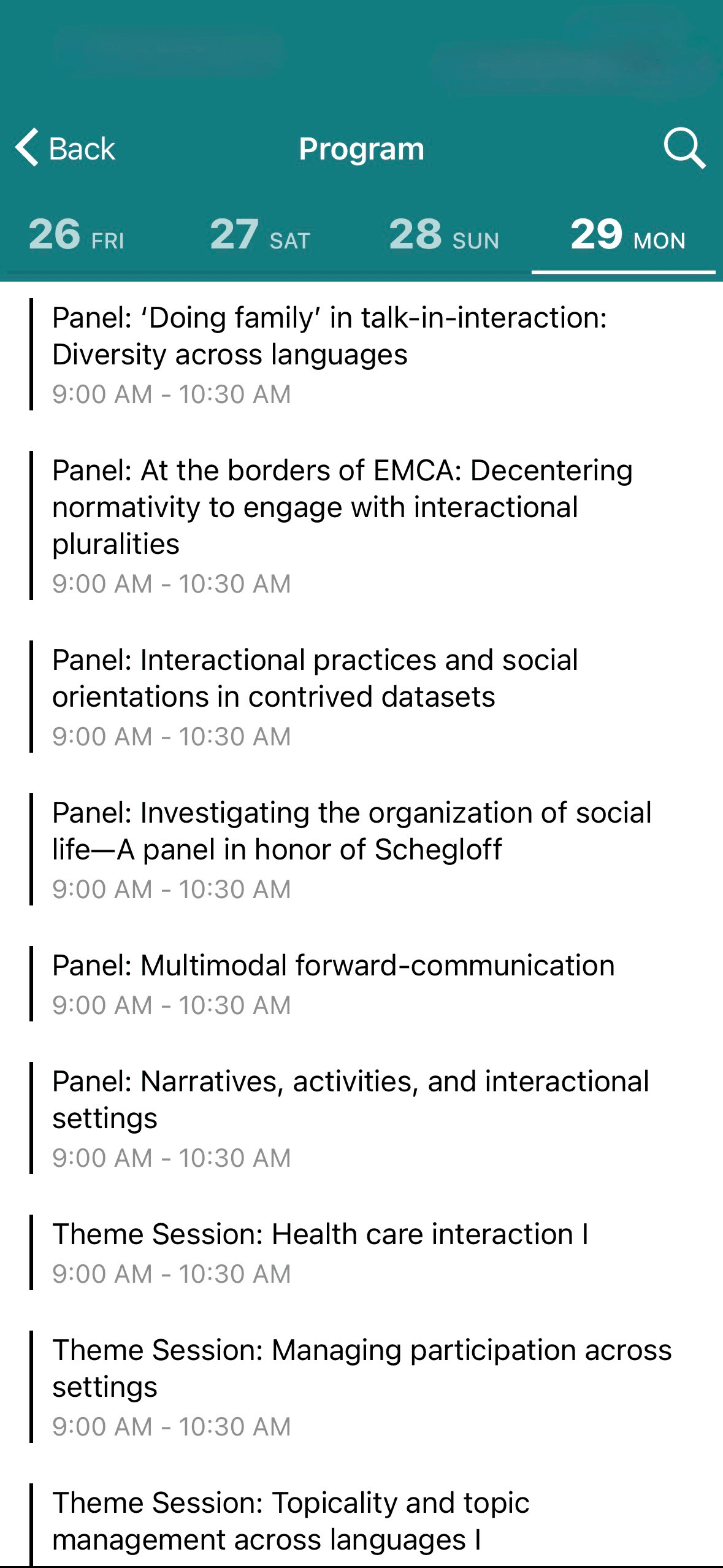
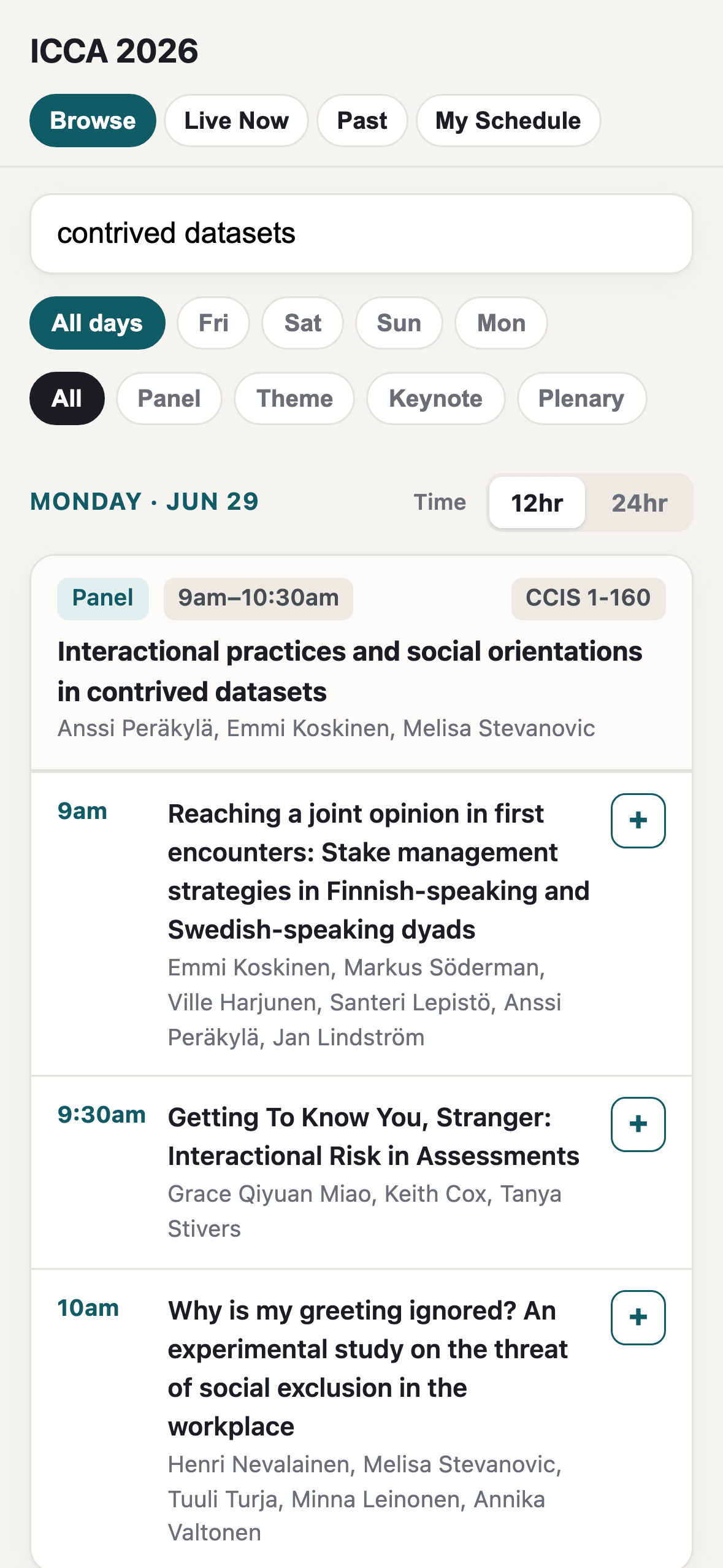
The official app lists one row per panel for the whole day. Mine breaks the same panel into its three individual talks, each independently addable: the granularity the official app's session-level view doesn't have.
Saving a talk
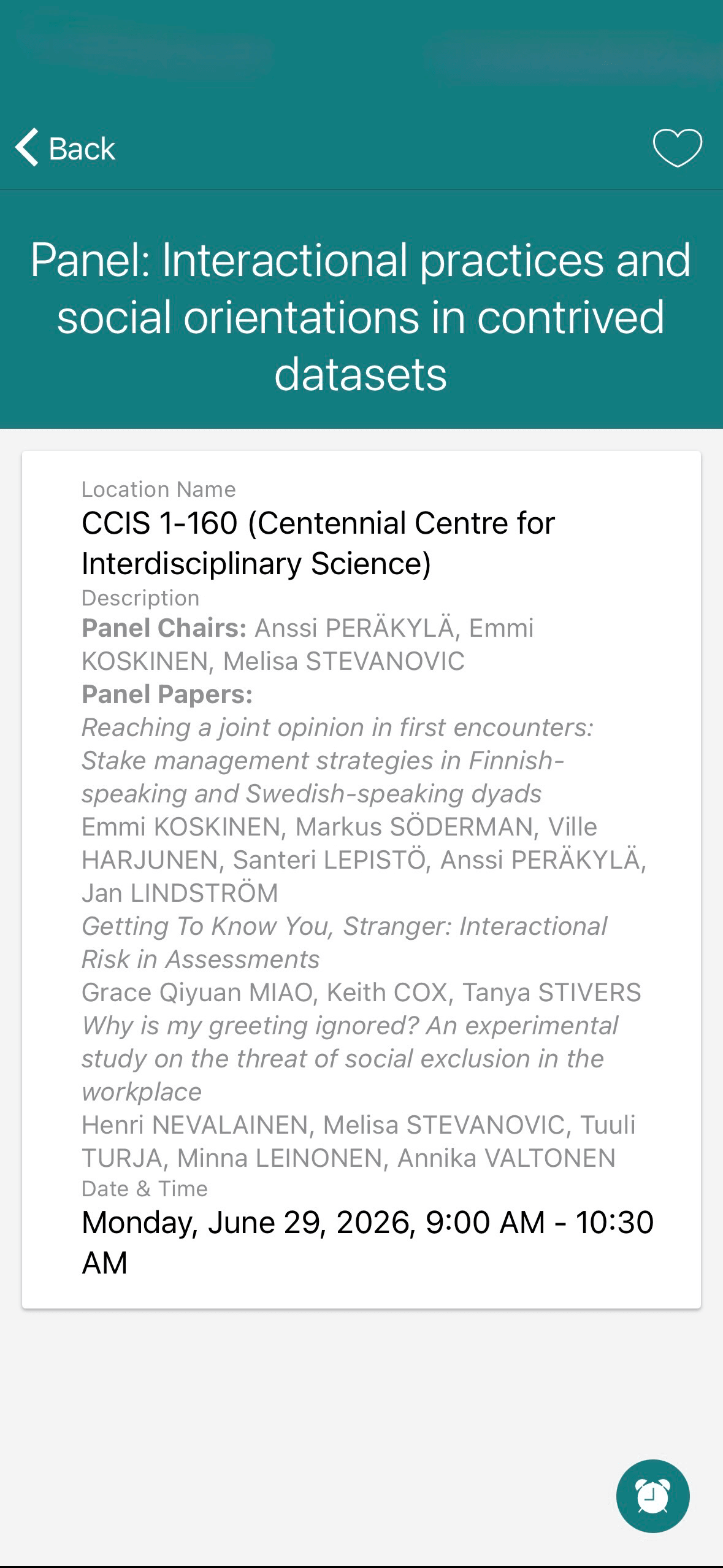
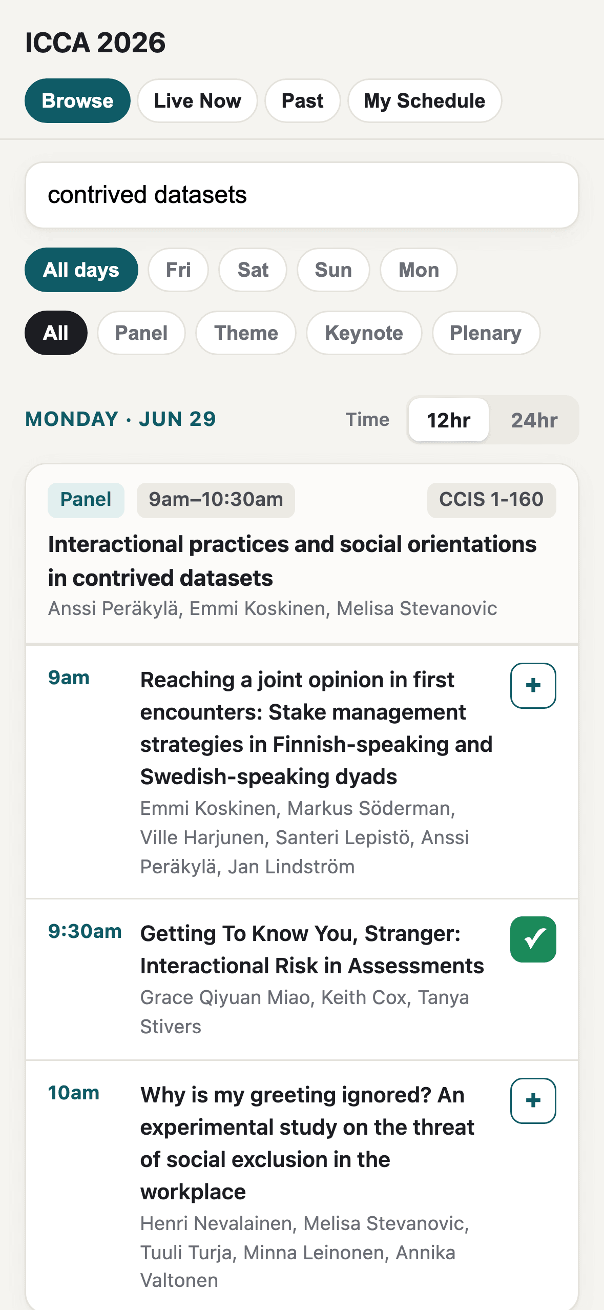
Saving in the official app means opening a panel's full detail page and tapping one icon for the whole session. Mine adds a specific talk inline, from the list, with the checkmark as its own confirmation.
Checking what's saved
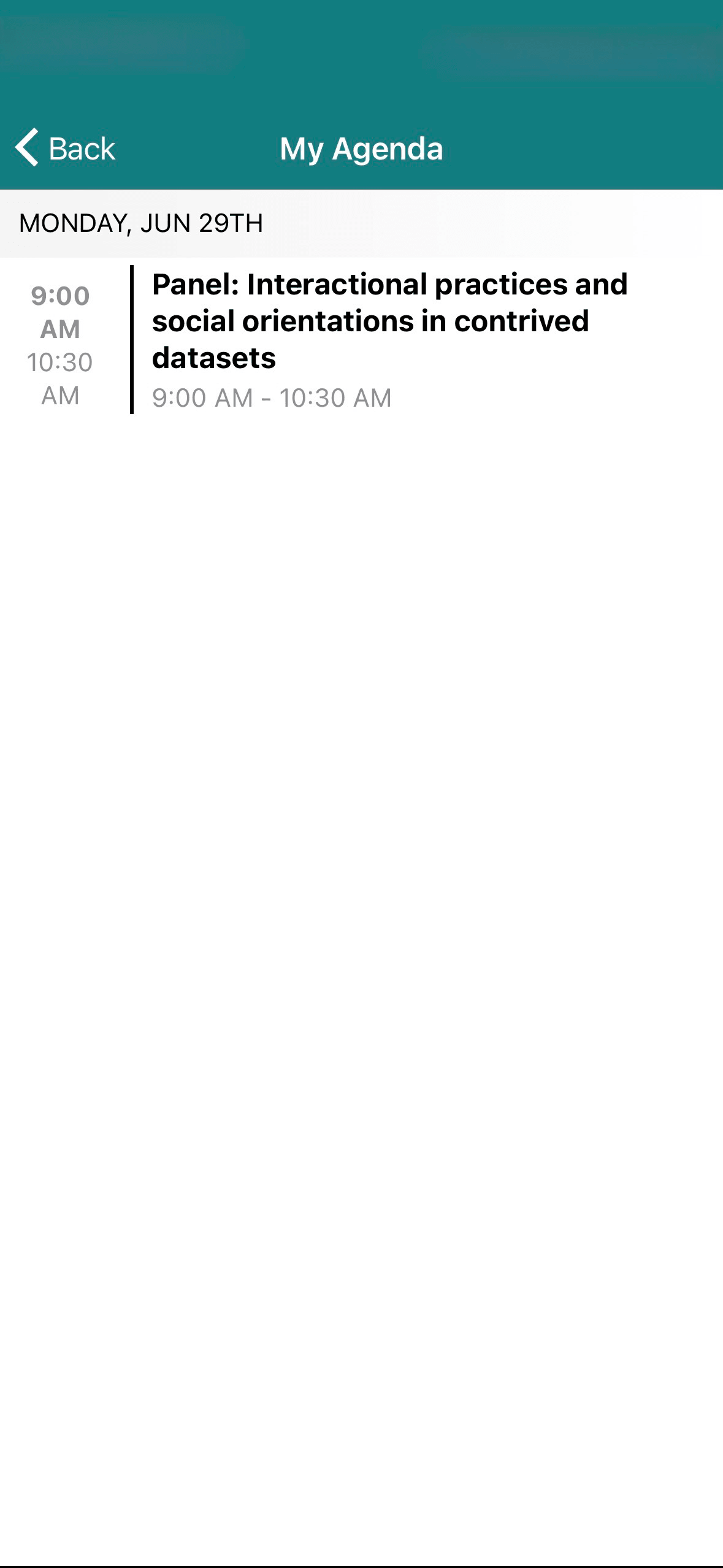
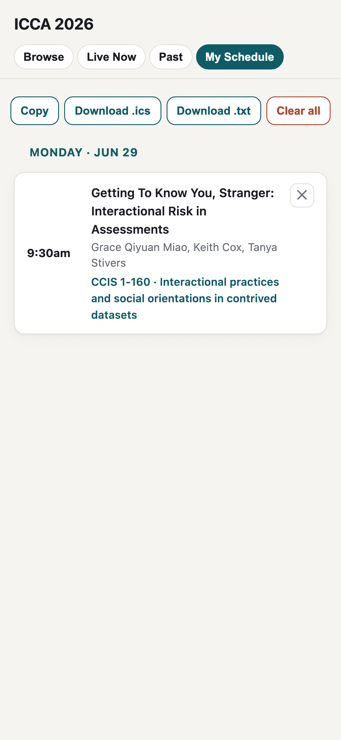
The official My Agenda shows a session's panel title and a time range, nothing else: no talk, no presenter. It never needs a conflict check, because it won't let a second overlapping session onto the list in the first place. Mine shows the talk itself, its presenters, and calendar export.
Finding what's happening right now
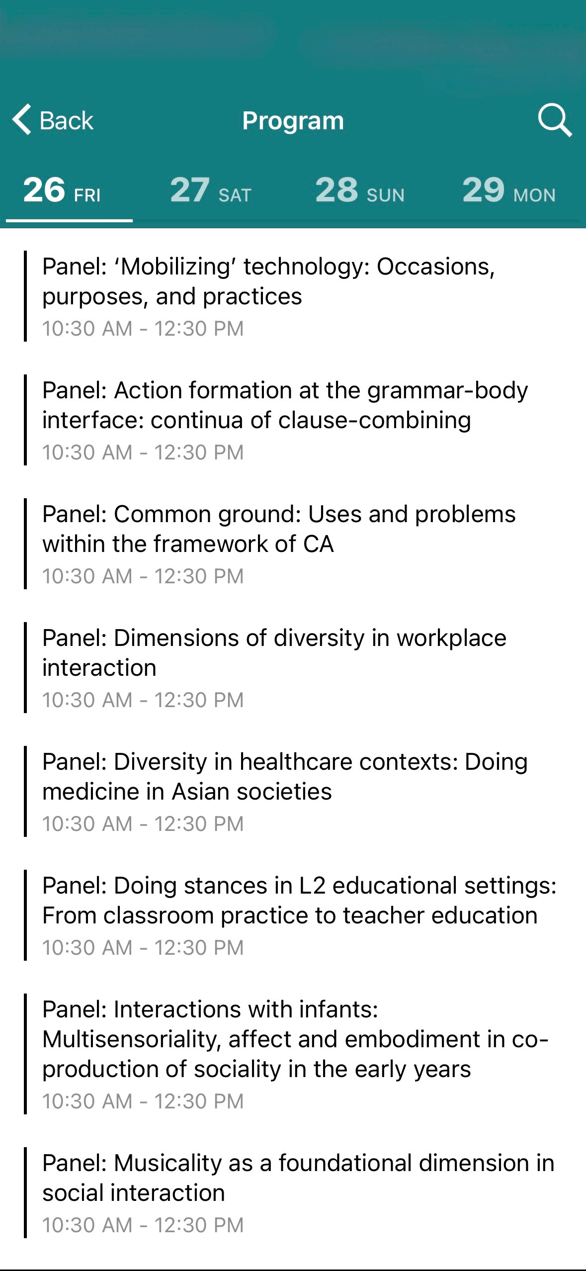
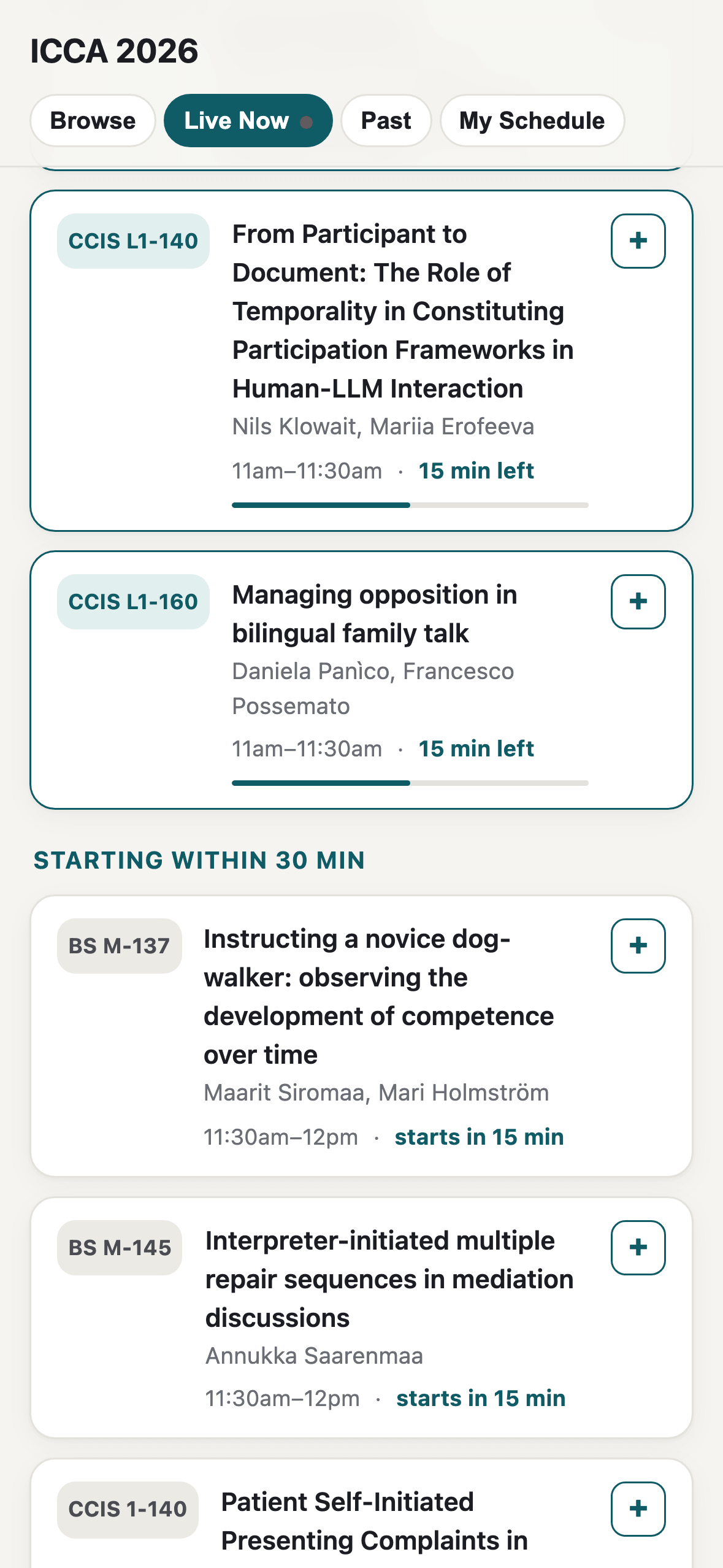
The official Program screen is a static list: every panel shows the same block time, and finding what's on right now means matching the clock yourself. The Live Now tab does that arithmetic for you, live, with a running countdown on each session.
Research & Data
Before trusting the program data in front of an audience of professional conversation analysts, it was cross-referenced against the conference's own official listing: the same audit-and-verify instinct that runs through the CA research on this site, applied to product data instead of transcripts.
- All 130 official session detail pages were fetched and parsed, then checked against the local dataset for title, organizer, room, date/time, talk order within each session, and presenter names. Result: 130 of 130 sessions matched, and every date, time, room, and talk-ordering value verified correct.
- Per-talk start and end times don't exist in the official data at all — the conference website, app, and PDF contain one block time for an entire panel, not a time per talk. The insight that unlocked per-talk scheduling anyway: the program already lists each panel's talks in presentation order, and every panel block divides evenly into fixed 30-minute slots, so a talk's real start time can be approximated as block-start plus 30 minutes times its position in that listed order. That approximation, not the official data, is what makes per-talk scheduling and conflict-flagging possible at all; it's documented here as a derived estimate rather than presented as if it came straight from the program.
- The audit surfaced three real errors in the local data, each traced and fixed: a phantom duplicate session pointing at a room that wasn't in use at that time (both of its talks already existed correctly elsewhere), all three keynotes restructured to carry an actual talk title and speaker instead of a placeholder header, and one missing co-presenter added.
- Equally important: the audit documents what was deliberately left unchanged, and why: abbreviated organizer surnames, intentionally shortened panel titles, one keynote title kept because the local version was more descriptive than the official one, and five identified typos on the official conference site itself (e.g. "Robert PRREENER" for Prettner, "Contunuation" for Continuation) that were correctly left uncorrected locally, since the local data was right and the official site was wrong.
Interaction Decisions
Some interaction design choices and the concrete failures they prevent.
Full-text search matches across talk titles, presenter names, panel/session titles, and rooms in one field, including matching a presenter's own name.
Prevents: An attendee who only remembers a speaker's name, not the talk title or room, having no way to find their own session in a printed-style listing. The official app's search field accepted text and returned nothing, which is worse than having no search at all: the box says the feature exists, so an attendee blames their query rather than the tool.
A talk is the unit that gets saved, not the panel that contains it: a three-paper panel renders as three rows with three separate add buttons.
Prevents: An attendee who wants the second paper of one panel and the third of another being forced to commit to a single room for the whole two-hour block: with the panel as the smallest saveable unit, as in the official app, a per-talk plan simply can't be written down.
My Schedule accepts both talks in an overlapping slot and marks the overlap in red, labeled "same time slot," rather than refusing the second one.
Prevents: The official app's failure mode, which was to block the save entirely: an attendee tracking their real options (both talks, decide in the moment) on paper or in their head, because the tool that was supposed to hold them treated a conflict as invalid input instead of as the normal state of a twelve-track conference.
The time format defaults to 24-hour; attendees opt into 12-hour, not the other way around.
Prevents: Defaulting to the U.S.-centric format at a conference where most attendees flew in from countries that read the clock in 24-hour time natively. The toggle exists for the minority who want it, without making them the assumed audience.
A Live Now tab surfaces whatever's in progress right now, rather than requiring the attendee to find today's date in a grid and match it against the clock.
Prevents: The dead-time cost of a jet-lagged attendee, mid-conference, manually scanning a day's full schedule just to find out what's happening in the next ten minutes.
Live Now and Past are computed against a hard-coded America/Edmonton clock (read via Intl.DateTimeFormat with an explicit IANA time zone), never the visitor's own device clock.
Prevents: A jet-lagged attendee whose phone hadn't caught up to Mountain Time, or who simply had automatic time zone updates turned off, silently seeing the wrong sessions marked as happening now, with nothing on screen to signal the mismatch.
Browse and Past re-render on their own every 60 seconds, so a talk migrates out of Browse into Past the moment its end time passes.
Prevents: An attendee still seeing an already-finished talk sitting in Browse because nobody thought to pull-to-refresh: the schedule quietly going stale between taps at a conference where sessions turn over every 30 minutes.
The entire program (130 sessions, 420 talks) is embedded as static JSON in the page itself, with no backend and no build step.
Prevents: A single afternoon's build getting bogged down in deployment infrastructure instead of the interaction problems that actually mattered; the whole app is one index.html.
Iteration
Day one → day two refinement pass
Shipped: The first working version shipped with search, day filters, and a Live Now tab already functional.
Broke: A run of small interaction problems showed up once real attendees were using it: filter tabs wrapped to a second line on mobile, the clock and location emoji cluttered every row without adding information, the time-format toggle sat disconnected from the date it affected, and the room pill's alignment made session cards harder to scan at a glance.
Fixed: A same-night refinement pass (2026-06-27, 03:16–03:31) fixed all four: white-space:nowrap on the tab pills so they can't wrap, the emoji removed from clock and location rows, the 12h/24h toggle moved inline with the first day header it controls, and the room pill right-aligned in the session-card header.
Program data: local vs. official
Shipped: The program was entered and structured locally from the conference schedule.
Broke: Two real data errors existed in the local copy: a phantom duplicate session ("Managing participation across settings" appeared twice, once pointing at a room not actually in use at that time) and three keynote entries that carried only a placeholder header with no talk title.
Fixed: Both fixed after the 130-page verification audit. See Research and Data above. The keynote fix alone brought the talk count from 417 to the correct 420.
Wording pass
Shipped: Empty states and section labels were written functionally on first pass, e.g. a bare count of "items shown."
Broke: Generic empty-state copy in Search and the day filters read as a dead end rather than telling the attendee what to try next.
Fixed: Empty-state messages in Search and the day-filter view were rewritten to be specific to what didn't match, and the Live Now section's wording was cleaned up separately, both small conversation-design decisions, in miniature, on the same day as the interaction fixes above.
Technical Collaboration
Built solo with Claude Code across a four-day, 24-commit history: from the initial upload through the data-verification fixes to a final README pass.
The one real collaboration in this project's story wasn't with a co-builder; it was the adoption itself: the organizing committee evaluated an unofficial, independently-built tool against their own official app and chose to promote it directly to all attendees inside 24 hours. That's an external, third-party validation of the interaction decisions above, not a self-reported one.
Outcome
322 unique users against fewer than 500 total attendees: roughly two-thirds of a four-day research conference used a scheduling tool built in a single afternoon, inside 24 hours of it existing. The exact attendee count wasn't published, so the denominator is stated as a bound rather than a false precision; the 322 figure is a point-in-time reading from the Vercel dashboard during the conference, and Web Analytics retention has since lapsed on the project. It's corroborated by the commit history itself: Web Analytics was installed the day after launch, which is why a usage figure exists to cite at all.
- from launch to official organizing-committee adoption
- < 24 hrsfrom launch to official organizing-committee adoptionconference organizers' own announcement
- unique users
- 322unique usersVercel dashboard, read during the conference
- conference attendees
- < 500conference attendeesthe official attendee count was published as "nearly 500"